
Workbooks in Plutora Analytics allow users to analyze and graph data from one or more data cubes.
The Analytics Admin or Analytics Analyst user permissions are required to create reports in Plutora Analytics.
1. Create a workbook
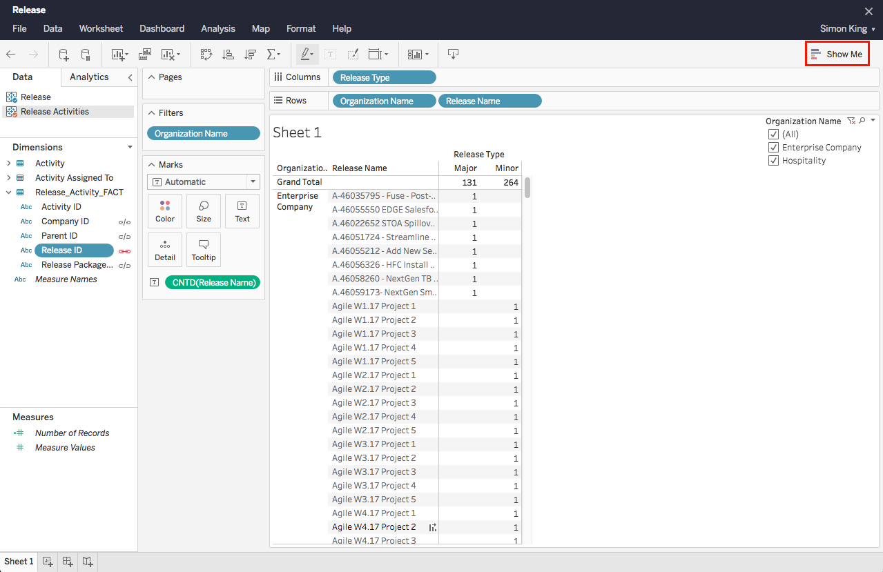
To create a workbook showing the list of Releases per Organization by Release Type:
- Go to:
- Plutora: Reporting > Analytics.
- Plutora Test: Click Plutora Analytics.

Plutora Analytics will only open if a single instance of Plutora or Plutora Test is open in your browser. If your pop up blocker prompts you when you try to open Plutora Analytics, disable it for the site.
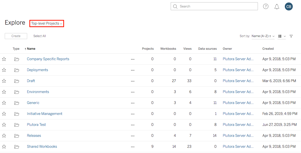
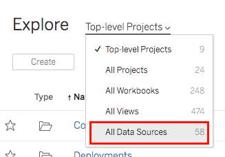
- Click Top-level Projects.
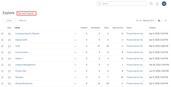
- Select All Data Sources.

- Browse for the Entity, for example, Releases:
- The Entity might be easier to find if you toggle the View
 mode between grid and list.
 - Initiative Management Form Instance data is now available in Plutora Analytics:
- Initiative Management Form Instance data includes the following data types: Checkbox, Checkbox Group, Date Field, Number, Radio Group, Select, Text Field, and Text Area.
- Each Initiative Management Form has its own data source containing the Form Instance data.
- Form Instance Workflow and Status data is included.
- The Entity might be easier to find if you toggle the View
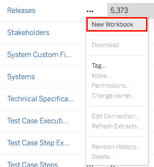
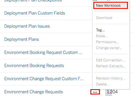
- Click the three dots beside the Entity.
- Select New Workbook.
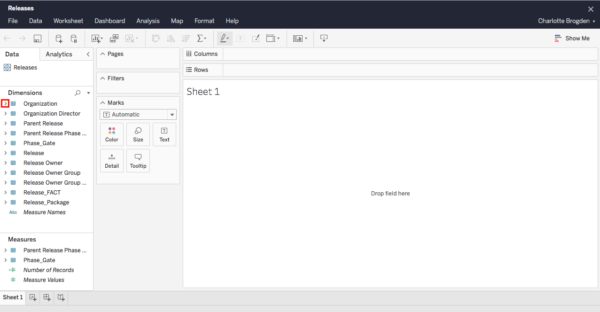
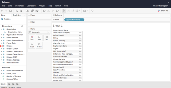
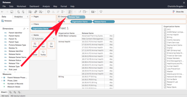
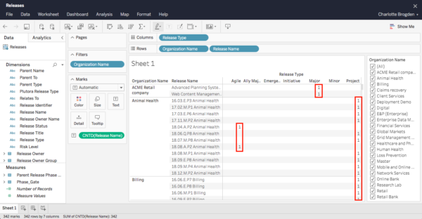
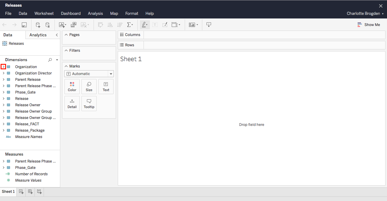
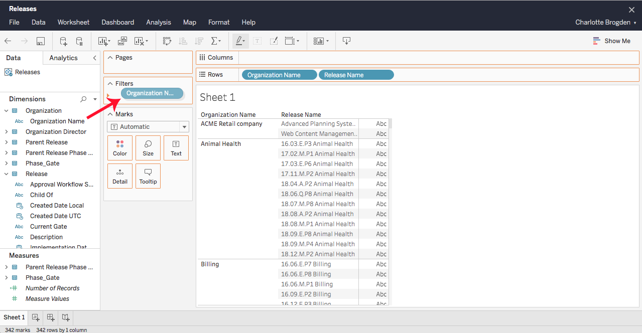
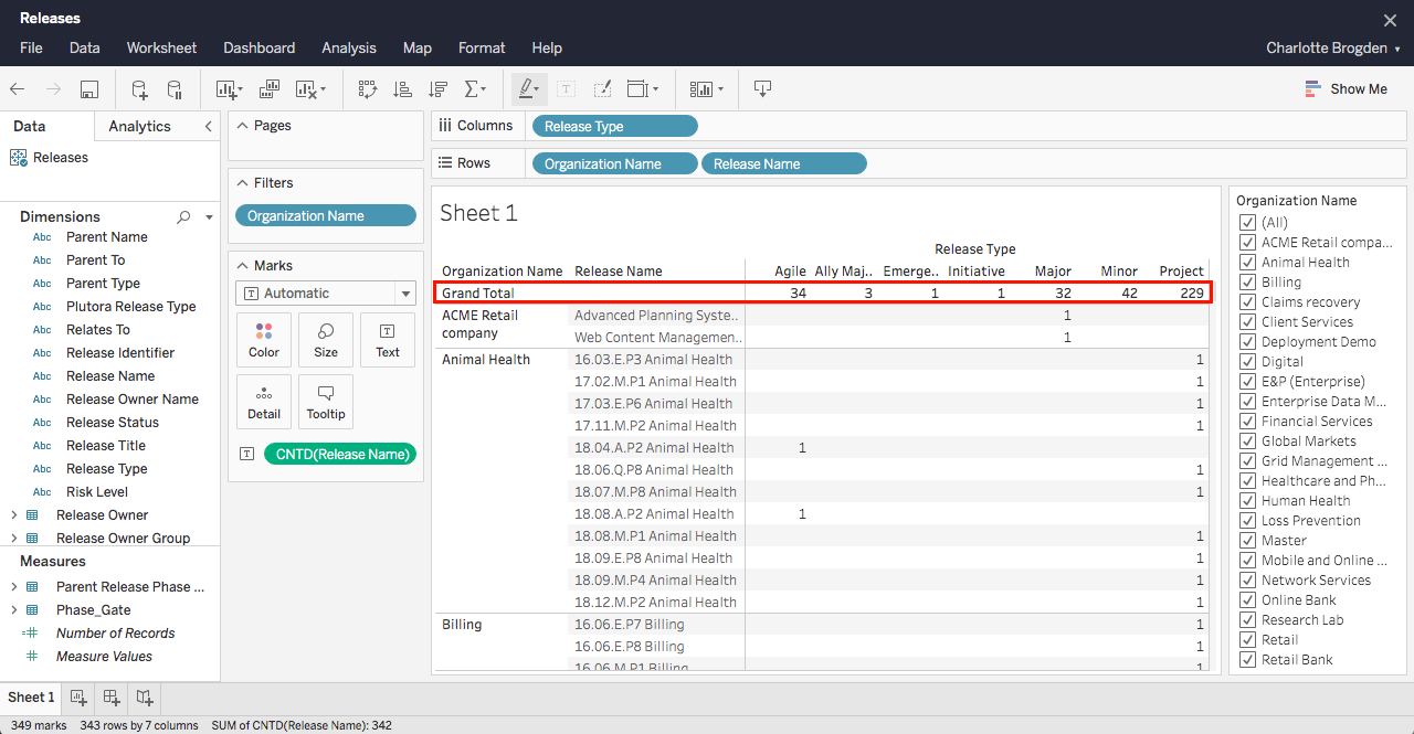
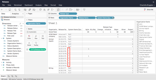
- Under Dimensions in the left-hand column, click the > beside Organization to open the list of Organization fields.
The following are now distinguished in the Deployment Plan FACT table: Master Deployment Plans, and Release ID. - Drag and drop the Organization Name field into Rows:
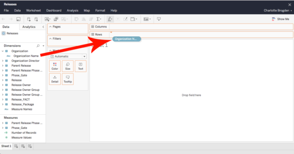
- Sheet 1 below Rows will populate with Organization Names.
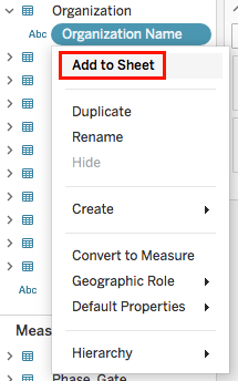
Custom Fields with a special character (!@#$%^*()+-=|\:/?,.&””<>{}[]_) as a label cannot be added to Plutora Analytics workbooks. - If the field vanishes when you drag and drop, click the downward-pointing triangle on the right side of the field
 and select Add to Sheet.
- Now, you can add record URLs to Plutora Analytic workbooks using Entity URL fields. For example, Release URL.
-
- The following entities have URL fields:
- Plutora:
- Releases.
- TEBRs.
- TECRs.
- Systems.
- Environment Groups.
- Deployment Plans.
- Plutora Test:
- Requirements.
- Test Plans.
- Defects.
- Plutora:
- The following entities have URL fields:
-
- Sheet 1 below Rows will populate with Organization Names.
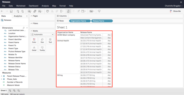
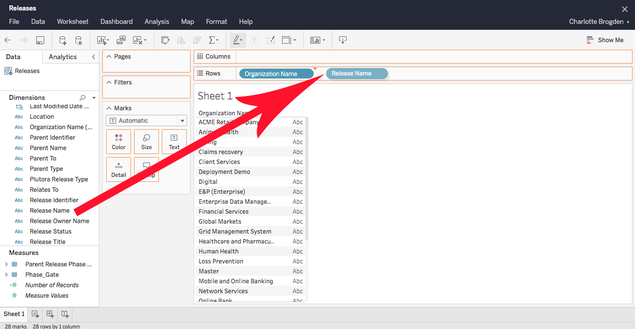
- Under Dimensions in the left-hand column, click the > beside Release to open the list of Release fields.
- Drag and drop the Release Name field into Rows to the right of the Organization Name field.

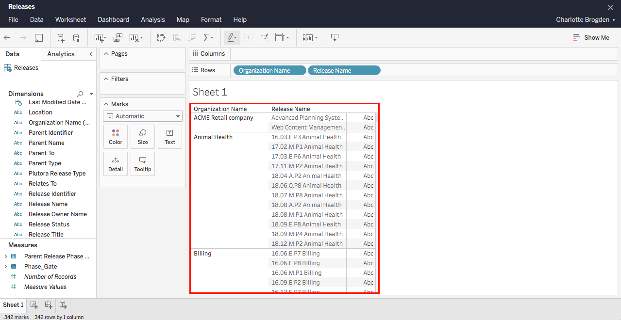
- Sheet 1 below Rows will list Organization Names with their associated Release Names.
- Sheet 1 below Rows will list Organization Names with their associated Release Names.
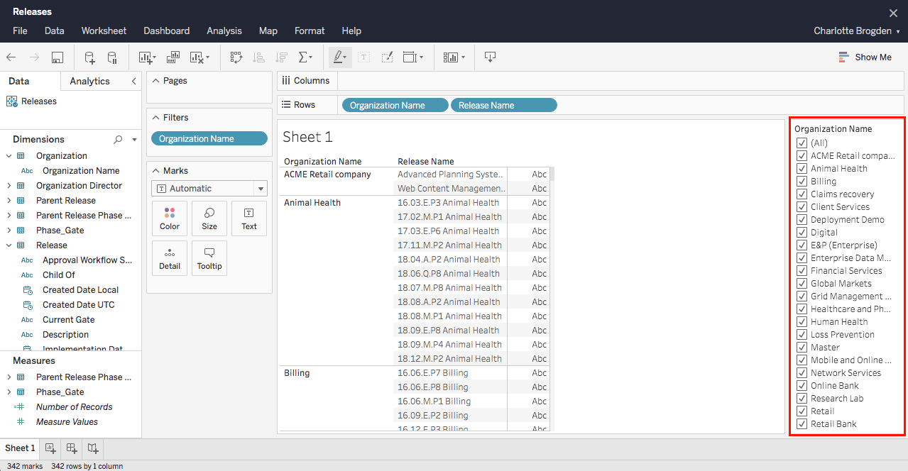
- Manage filters:
- Drag and drop the Organization Name field into Filters.
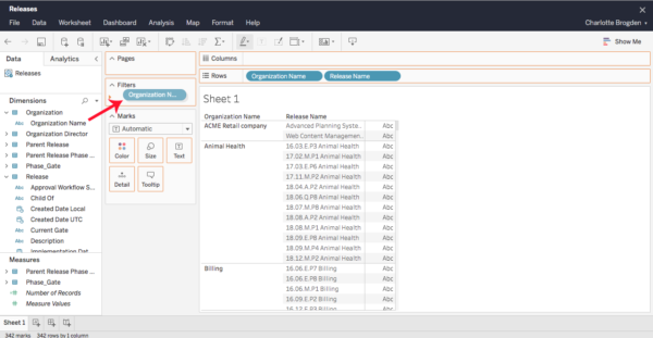
The Organization Names, with checkboxes to filter them, populate on the right of the screen.

- Click to select or deselect checkboxes to filter whether those Organization Names appear on the sheet.
- Drag and drop the Organization Name field into Filters.
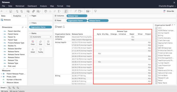
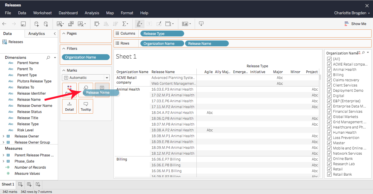
- Drag and drop the Release Type field into Columns.
Sheet 1 below Rows will populate with a column for each Release Type with ABC marking the presence of data.
Release Type uses files from the Release Type Customization. To find out if a Release is Enterprise, Project, or Independent, use Release Title.
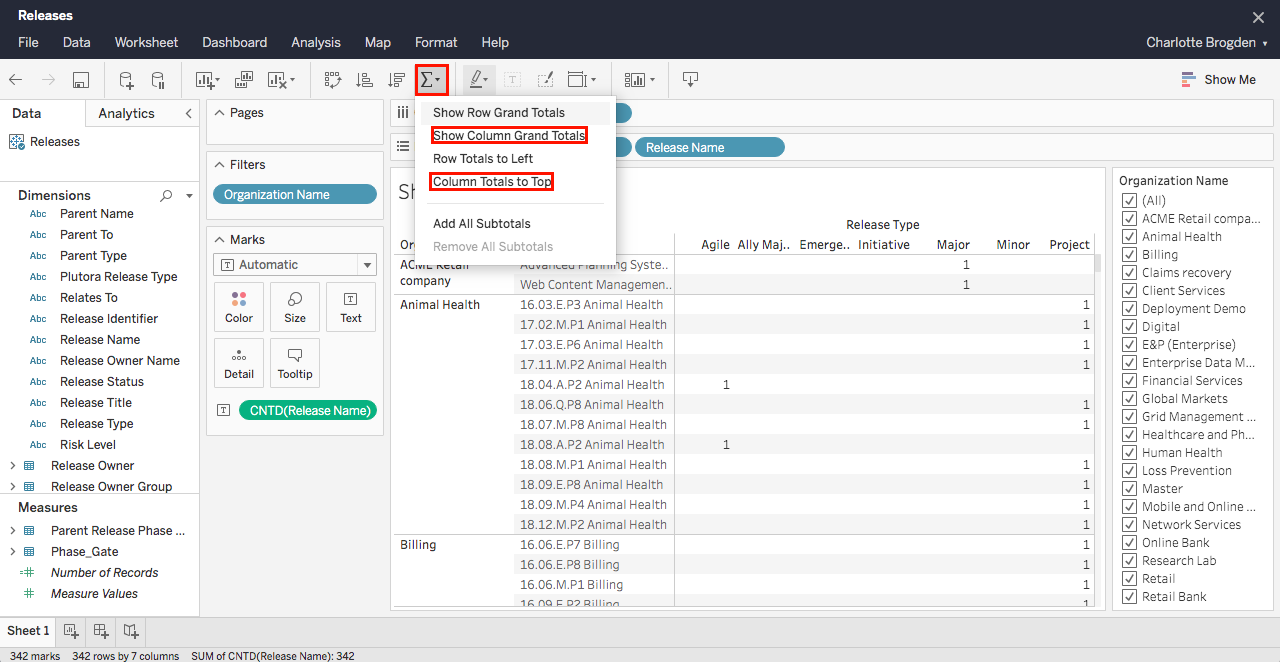
- Count the number of Releases per Release Type:
- From under Dimensions, drag and drop the Release Name field into Text.

Release Name appears as a text field under the Text button.
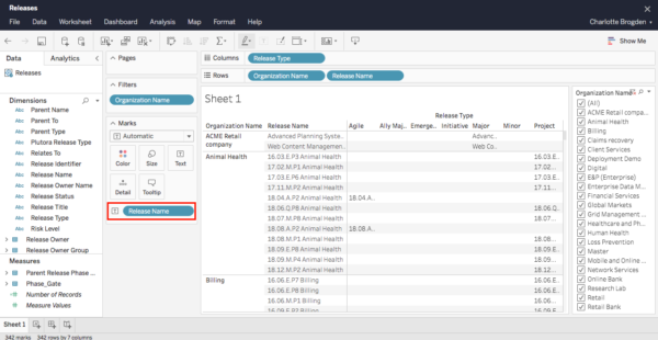
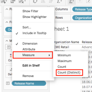
- Click Release Name under the Text button and select Measure > Count Distinct.
The count data will appear.
- From under Dimensions, drag and drop the Release Name field into Text.
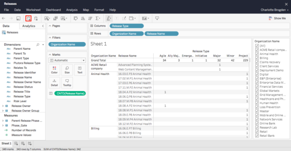
- Count the total number of Releases:
- Click Sum and select Show column grand totals.
- Click Sum again and select Column totals to top.

The grand totals appear at the top of each column.

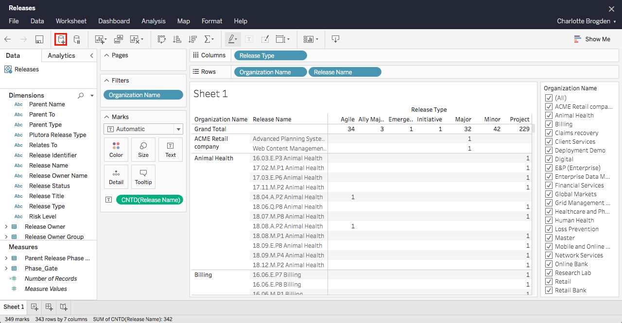
- Connect to another data cube:
- Click the add cube button.
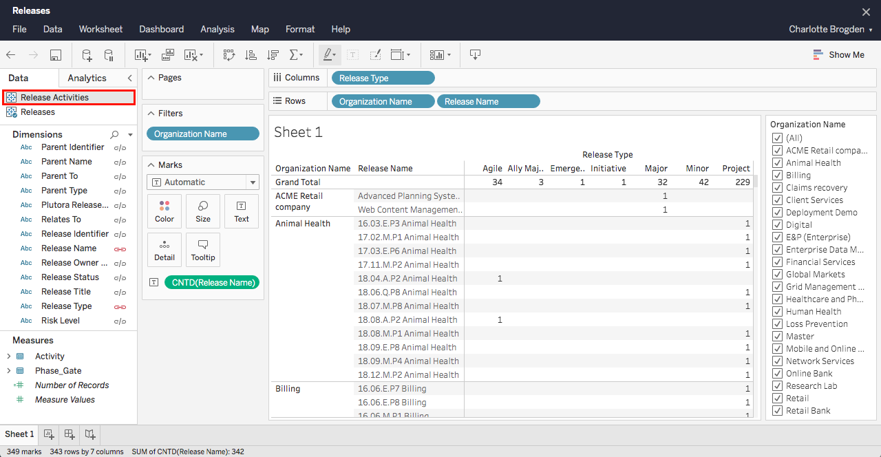
- Click to select another cube, for example, Release Activities.
- Click Add data source.
Another cube appears under Data.

- Click to select the new cube (if it isn’t selected already).
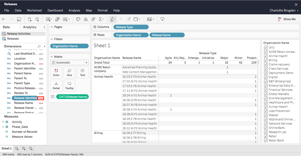
- Click the > beside the new menu to open it and show the fields from the new cube.
- Link the two cubes by clicking the link button beside a field. Now the fields from the new cube can be dragged and dropped like the fields from the old cube.

To ensure correct data is displayed, only click the link buttons in the FACT tables.
- Click the add cube button.


2. Tips and Tricks
Here are some tips and tricks to tackle any problems or quirks you might encounter:
Asterisks
- If you are seeing asterisks in your data tables:
- You are using a multidimensional data source as a secondary data source.
- To prevent this, use a ‘bottom up’ approach by adding data cubes that are lower on the hierarchy first. For example, add Release Activities cube before adding Releases cube.
- To stop asterisks showing, clear your columns and rows and start again using the secondary data source as primary.
- Link data cubes if necessary and all your data will appear without asterisks.


Dates and Times
Managing the appearance of dates and times in your sheets:
-
- Fields that contain date and time data have a calendar clock icon.

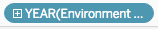
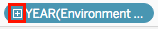
- When users drag and drop a date and time field into Rows or Columns, it appears as + YEAR(Field Name).
- To drill down further:
- Click the plus sign
 to open a QUARTER column or row.
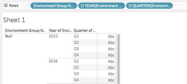
- Click the plus sign on QUARTER to open a MONTH column or row.
- Click the plus sign on MONTH to open a DAY column or row.
- Click the plus sign on DAY to open an HOUR column or row.
- Click the plus sign on HOUR to open a MINUTE column or row.
- Click the plus sign on MINUTE to open a SECOND column or row.
- Click the plus sign
- To drill back up, click the minus sign.

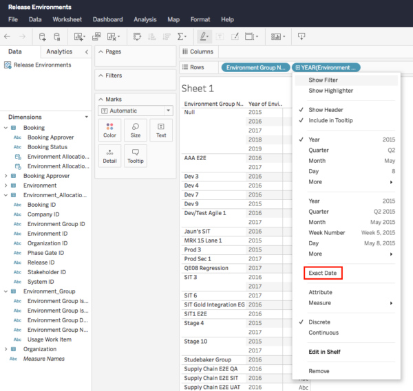
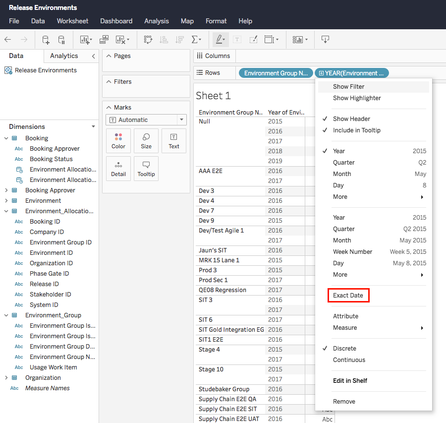
- To reveal the full date and time:
- Open the field menu and click Exact Date.
Dates and times appear as a bar graph.
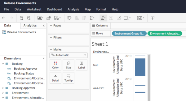
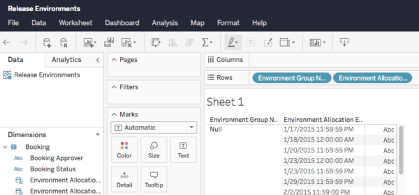
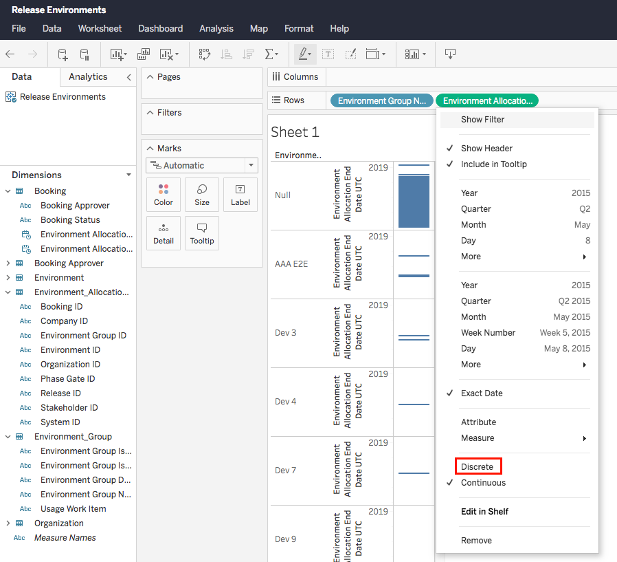
- To change the bar graphs to discrete dates, open the field menu again and click Discrete.

The bars turn to discrete dates.
- Open the field menu and click Exact Date.
- Fields that contain date and time data have a calendar clock icon.


Pie Charts
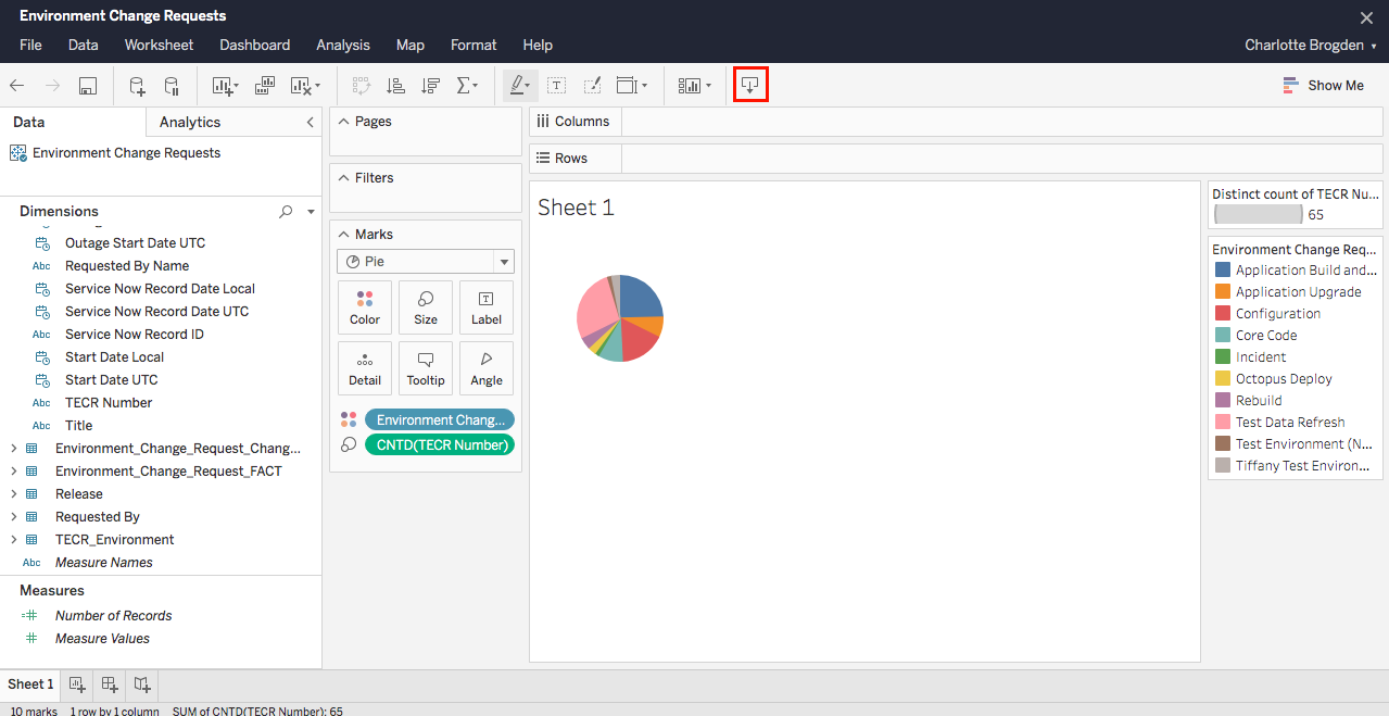
To create a single pie chart from TECR data:
- Go to:
- Plutora: Reporting > Analytics.
- Plutora Test: Click Plutora Analytics.

Plutora Analytics will only open if a single instance of Plutora or Plutora Test is open in your browser. If your pop up blocker prompts you when you try to open Plutora Analytics, disable it for the site.
- Click Top-level Projects.
- Select All Data Sources.
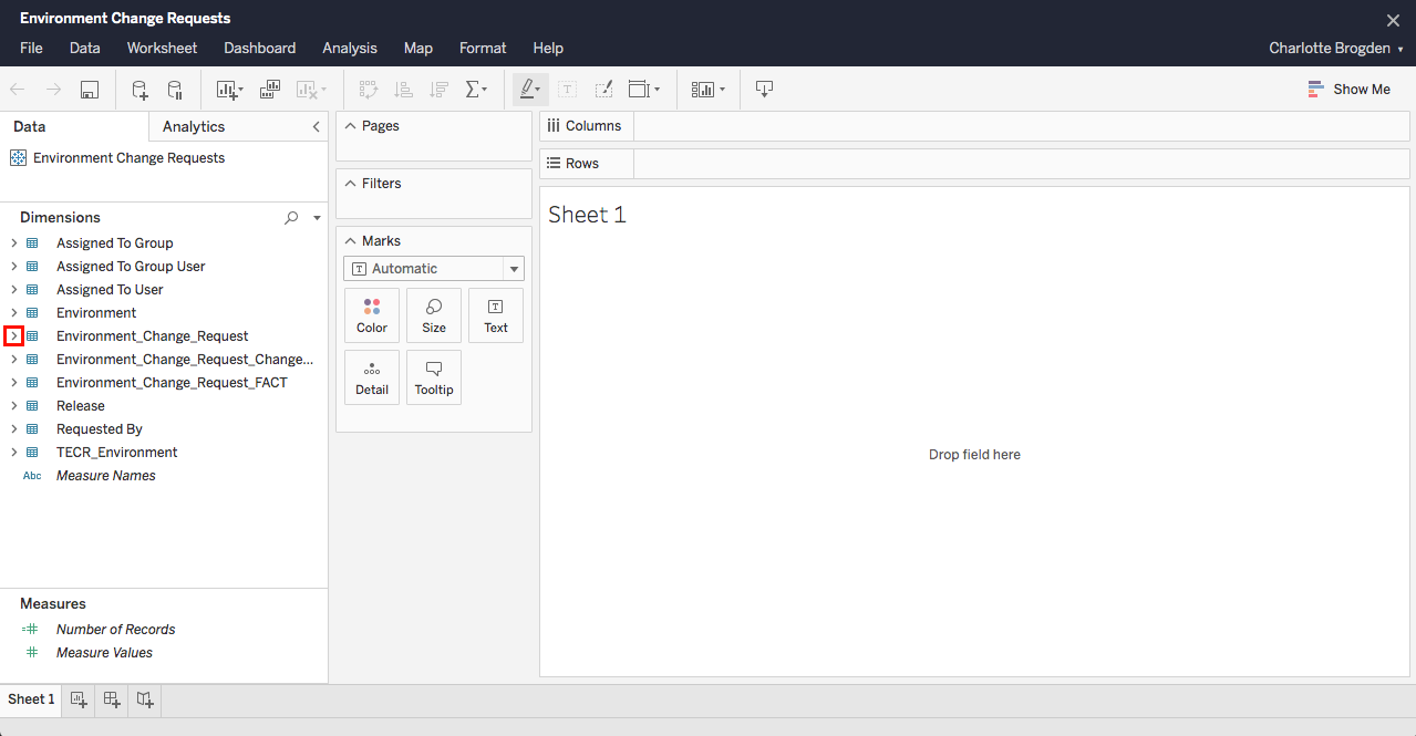
- Browse for the Entity Environment Change Requests.
The Entity might be easier to find if you toggle the View mode between grid and list. - Click the three dots beside the Entity.
- Select New Workbook.

- Open the Environment_Change_Request folder by clicking >.
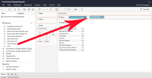
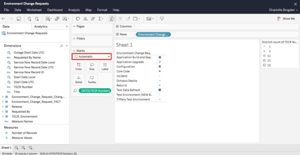
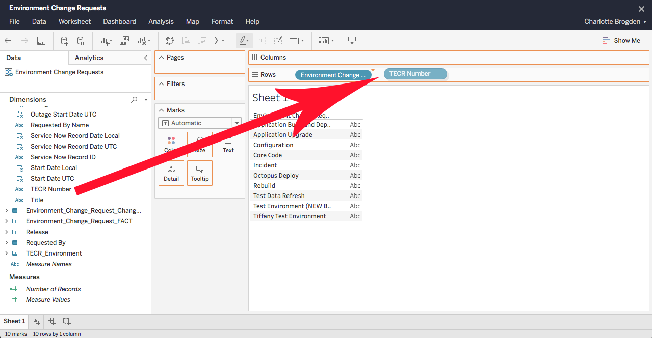
- Drag and drop the Environment Change Request Type field into Rows.
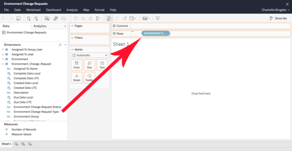
- Drag and drop the TECR Number field into Rows to the right of the Environment Change Request Type field.
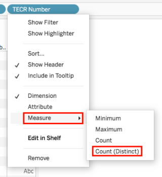
- Open the TECR Number field menu and select Measure > Count (Distinct).
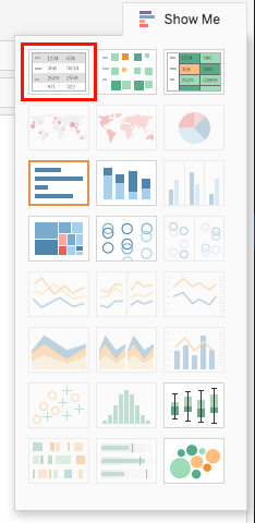
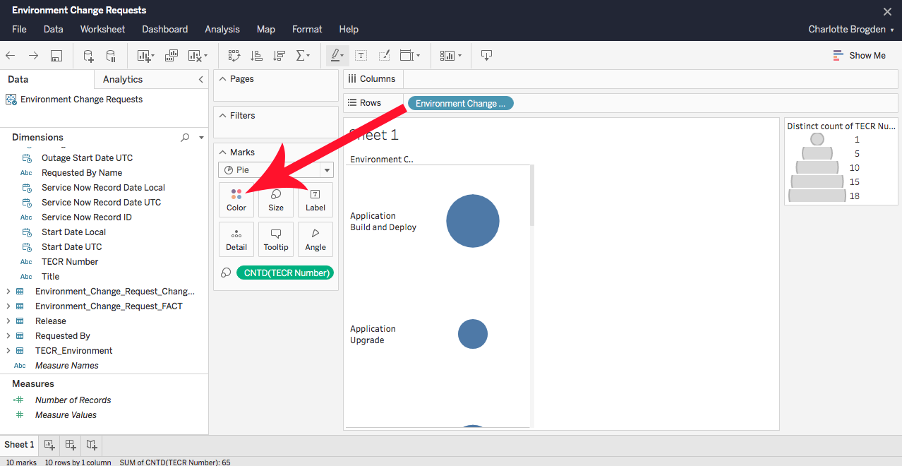
- Select the text tables view from Show Me.
- Click Show Me again to close the menu.
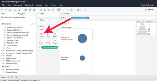
- Hold down the Ctrl key on your keyboard and use your mouse to drag and drop CNTD(TECR Number) into Size.
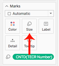
On the Mac, hold down the Alt-Option key. - Select Pie from the Marks drop-down menu.
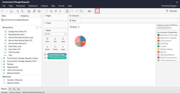
- Hold down the Ctrl (or Alt-Option on a Mac) key on your keyboard and use your mouse to drag and drop Environment Change Request Type field into Color.
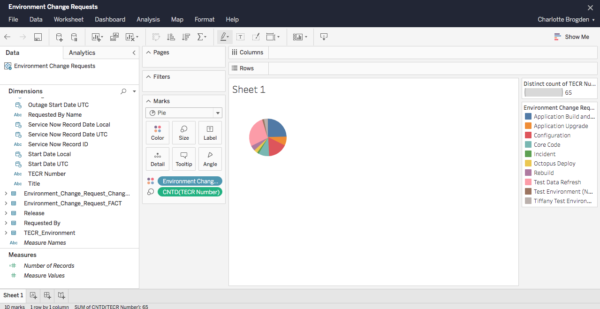
The TECR data becomes a pie chart.
- Drag and drop the TECR Number field into Rows to the right of the Environment Change Request Type field.


3. Export or print the data
To export or print the data from the report above:
- Click the export button.
- Select one of the following data formats to export:
- Image:
- Click Download to download a .png image of the data.
- Data.
This feature is grayed out and unavailable. - Crosstab.
This feature is grayed out and unavailable. - PDF:
- Select the layout: Portrait or Landscape.
- Select the content: This Sheet or all of the Sheets in Workbook.
- Select a Paper Size.
- Leave scaling as Automatic.
- Click Generate.
- Click Download.
- Powerpoint.
- Tableau Workbook.
- Image:
4. Convert the data to a graph
To convert the data to a graph:
- Click Show Me.

- Click to select a graph type.
The data is turned into the selected graph with the legend on the right under the filter.
![]()