
Release Management KPIs Dashboard allows enterprises to track key metrics and past performance across Releases.
Why Use this Dashboard?
KPIs are a retrospective tool, which helps enterprises look at their past performance. Using the Release Management KPIs Dashboard, you can find out:
- How your enterprise has performed historically.
- How trends have changed over time.
- How this year’s performance compares with last year or the year before.
Questions Answered
The Release Management KPIs Dashboard is designed to answer the following questions:
-
How many releases have we completed?
-
How long does it take to complete each release and phase of the release?
-
How many releases result in incidents, defects, or issues in production?
-
How much many changes are we delivering in each release?
-
How many of those changes are new features, defect fixes, or technical debt?
-
How many unplanned releases (for example, hotfixes) did we do compared to planned releases (for example, value adding)?
Expected Value and Outcomes
The Release Management KPIs Dashboard aims to:
-
Take a retrospective look at past releases and identify positive and negative trends including:
-
Increases in planned release frequency.
-
Reductions in emergency release frequency.
-
Increases in the number of epics and stories.
-
Reductions in the number of defects.
-
Reductions in the number of incidents and impacts to service availability.
-
-
The report shows where you need to improve and indicates whether or not prior improvements have resulted in positive trends.
Location
To locate the Release Management KPIs dashboard:
- Go to Dashboard > Release Management KPIs.
Layout
Filters
The Release Management KPIs Dashboard has the following filters:
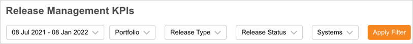
Select one or more filters, then click Apply Filter to see the data:
- Dates:
- By default, the current date to the previous 6 months is loaded.
- The maximum date range is 2 years.
- Days outside the date range are grayed out.
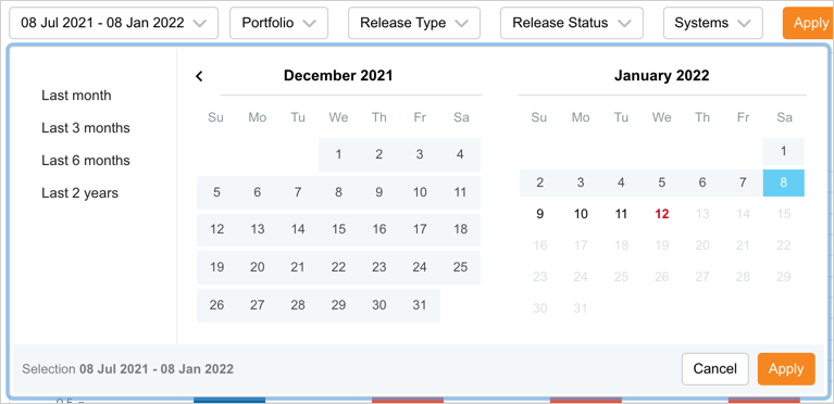
- If a range of more than 2 years is selected, it will not save after clicking Submit.
- Days outside the date range are grayed out.
- Portfolio:
- By default, All is selected.
- Click to select one or more checkboxes.
- If you select a parent portfolio, the children are automatically selected.
- Release Type:
- By default, All is selected.
- Click to select one or more checkboxes.
- Click Select All to toggle whether all checkboxes are selected or not.
- Release Status:
- By default, All is selected.
- Click to select one or more checkboxes.
- Systems:
- By default, All is selected.
- Click to select one or more checkboxes.
Widgets
Releases Over Time
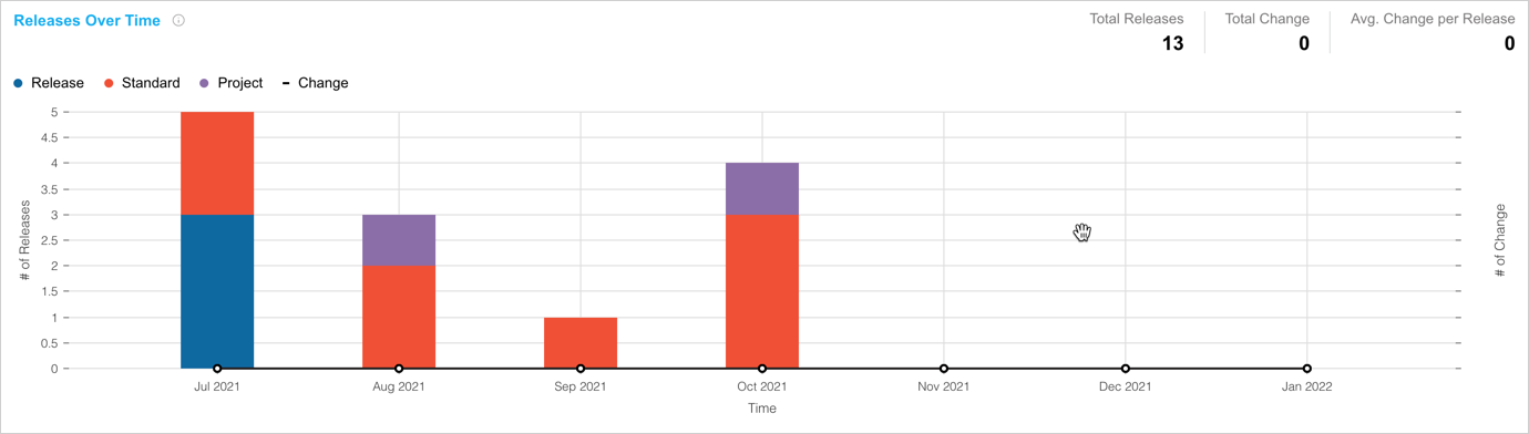
The total number of Releases during the selected time interval. This graph shows how many releases have been completed over a given time so you can see if you are increasing our release frequency.
- The columns show Releases over time by Release Type. For example, Hotfix, or Patch.
- A positive trend to look for would be an increase in planned release types and Changes per Release and a decrease in unplanned release types.
- Filter by Portfolio to compare production between portfolios.
- If the filter duration is more than 365 days, the graph displays in years.
- If the filter duration is greater than 90 days and less than or equal to 365 days, the graph displays in months.
- If the filter duration is less than 90 days, the graph displays in weeks.
Releases by Type
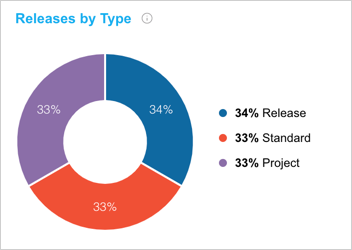
Percentage breakdown of the Releases, arranged by Release Type, which will be implemented during the selected time interval. This chart shows the overall number of Releases for the filtered time period broken down by Release Type.
- Releases by Release Type, as a percentage from highest to lowest, starting clockwise from the right.
- Provides a view by overall percentage as opposed to Releases Over Time widget’s view by time.
Releases by Portfolio
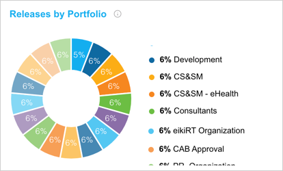
Percentage breakdown of the Releases, arranged by Portfolio Association, which will be implemented during the selected time interval. This graph shows the overall number of Releases for the filtered time period broken down by Portfolio Association.
- Releases divided by portfolio, as a percentage from highest to lowest, starting clockwise from the right.
- Provides a view by overall percentage as opposed to Releases Over Time widget’s view by time.
Releases by Risk Level
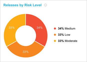
Percentage breakdown of the Releases, arranged by Risk Level, which will be implemented during the selected time interval. This graph shows the overall number of Releases for the filtered time period broken down by Risk Level.
- Releases divided by Risk Level, as a percentage from highest to lowest, starting clockwise from the right.
- Provides a view by overall percentage as opposed to Releases Over Time widget’s view by time.
Average Release Duration Over Time
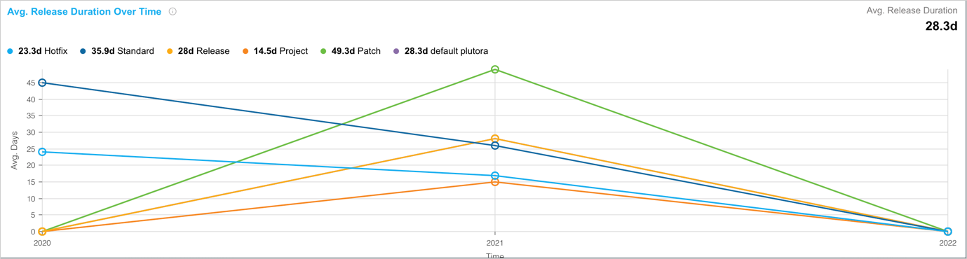
The average duration of each Release Type, shown monthly by the Release implementation date, calculated from the earliest phase start date to the last end date and time, for the selected time interval. This chart shows how long it took to complete each type of Release on average so that you can see if you are increasing your efficiency and the average duration is decreasing.
- See the duration and Release Type of your Releases over time.
- You would expect Major and Enterprise Releases to have a much longer duration than a Patch or a Hotfix.
- You would also want to see a downward trend, showing that Releases are becoming more frequent.
- If the filter duration is less than or equal to 30 days, the x-axis time period will be days.
- If the filter duration is greater than 30 days and less than or equal to 90 days, the x-axis time period will be weeks.
- If the filter duration is greater than 90 days, the x-axis time period will be months.
Average Phase and Gate Duration
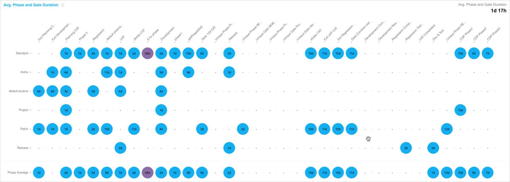
The average duration for each Phase and Gate for each Release Type. This chart shows the average time it took to complete each Phase or Gate,
- Compares the average duration of Phases and Gates per Release Type.
- Short duration: Medium Blue.
- Medium duration: Light Blue.
- Long duration: Purple.
Changes Over Time
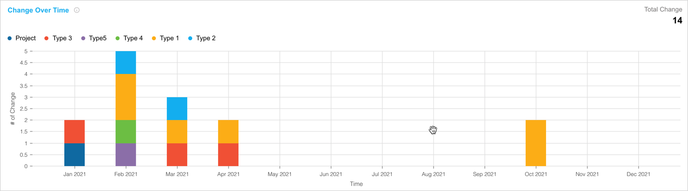
For the selected time interval, it shows the total number of Changes delivered as part of a Release by Release Implementation Date.
This chart shows how much scope was delivered each month, so that you can see the level of change that has reached the production environment and whether that level is increasing or decreasing.
- Shows how many deliverable scope items are being delivered over time and by Change Type, and what is the breakdown of these items, and who is delivering the most by portfolio?
- This widget can be particularly useful if Change Type is used to record epics, features, stories, defects, tech debt, and so on.
- If the filter duration is less than or equal to 30 days, the x-axis time period will be days.
- If the filter duration is greater than 30 days and less than or equal to 90 days, the x-axis time period will be weeks.
- If the filter duration is greater than 90 days, the x-axis time period will be months.
Changes by Portfolio
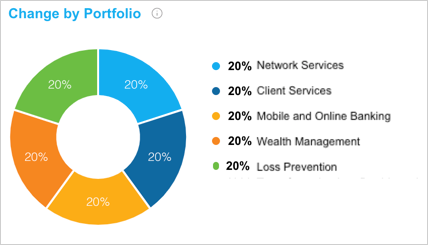
Percentage breakdown of Changes, arranged by Portfolio Association, which will be implemented during the selected time interval. This chart shows the overall number of Changes for the filtered time period broken down by Portfolio Association.
- Changes divided by portfolio, as a percentage from highest to lowest, starting clockwise from the right.
- Provides a view by overall percentage as opposed to Changes Over Time widget’s view by time.
Changes by Type
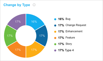
Percentage breakdown of Changes, arranged by Change Type, which will be implemented during the selected time interval. This chart shows the overall number of Changes for the filtered time period broken down by Change Type.
- Changes divided by Change Type, as a percentage from highest to lowest, starting clockwise from the right.
- Provides a view by overall percentage as opposed to Changes Over Time widget’s view by time.
Changes by Theme
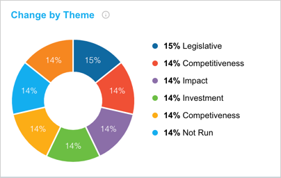
Percentage breakdown of Changes, arranged by Change Theme, which will be implemented during the selected time interval. This chart shows the overall number of Changes for the filtered time period broken down by Change Theme.
- Changes divided by Change Theme, as a percentage from highest to lowest, starting clockwise from the right.
- This widget can be particularly useful if Change Theme is used to record whether the change is for compliance, legislative, security, performance, retention, and so on.
- Provides a view by overall percentage as opposed to Changes Over Time widget’s view by time.
PIR Items Over Time
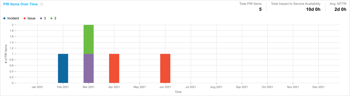
For the selected time interval show the total number of PIR Items by Release Implementation Date. This graph shows how many defects and incidents occur in production each month so you can see the quality of our Releases.
- Shows the number of incidents, defects, issues, and retrospective items over time and PIR Item Type.
- The trend to be looking for is fewer items over time.
- PIR Items are linked back to their Release’s Implementation Date so that reports made later are still tracked to their correct date.
- The Total Impact to Service Availability summarizes the entire duration of impact to service availability for the filtered time period.
- The Avg MTTR shows the entire duration of time to recover after an outage.
- The user story for this widget could be: “As a Release Manager, what I am really concerned with is about release success and a KPI is how many incidents, defects, issues, or outages occurred in production?”
- If the filter duration is less than or equal to 30 days, the x-axis time period will be days.
- If the filter duration is greater than 30 days and less than or equal to 90 days, the x-axis time period will be weeks.
- If the filter duration is greater than 90 days, the x-axis time period will be months.
PIR Items by Portfolio
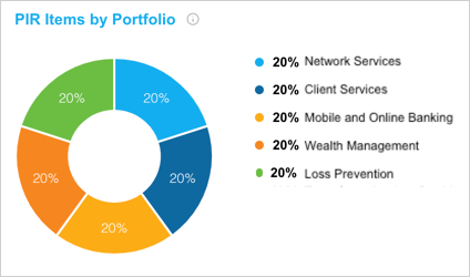
Percentage breakdown of PIR Items, arranged by Portfolio Association, which will be implemented during the selected time interval. This chart shows the overall number of PIR Items for the filtered time period broken down by Portfolio Association.
- PIR Item divided by portfolio, as a percentage from highest to lowest, starting clockwise from the right.
- Provides a view by overall percentage as opposed to PIR Items Over Time widget’s view by time.
PIR Items by Type
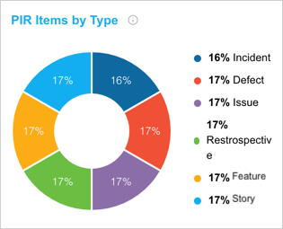
Percentage breakdown of PIR Items, arranged by PIR Item Type, which will be implemented during the selected time interval. This chart shows the overall number of PIR Items for the filtered time period broken down by PIR Item Type.
- Changes divided by PIR Item Type, as a percentage from highest to lowest, starting clockwise from the right.
- Provides a view by overall percentage as opposed to PIR Items Over Time widget’s view by time.
PIR Items by Category
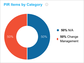
Percentage breakdown of PIR Items, arranged by PIR Item Category, which will be implemented during the selected time interval. This chart shows the overall number of PIR Items for the filtered time period broken down by PIR Item Category.
- Changes divided by PIR Item Category, as a percentage from highest to lowest, starting clockwise from the right.
- Provides a view by overall percentage as opposed to PIR Items Over Time widget’s view by time.
PIR Items by Theme
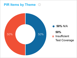
Percentage breakdown of PIR Items, arranged by PIR Item Theme, which will be implemented during the selected time interval. This graph shows the overall number of PIR Items for the filtered time period broken down by PIR Item Theme.
- Changes divided by PIR Item Theme, as a percentage from highest to lowest, starting clockwise from the right.
- Provides a view by overall percentage as opposed to PIR Items Over Time widget’s view by time.