
See Quick Start Guide – Form Builder Customization for the context of this article. The previous article was 1g. Manage Form Builder Permissions and the next article is 1i. Delete IM Forms.
Form Designer allows administrators to create the tabs, panels (sections), and fields that make up Initiative Management (IM) forms.
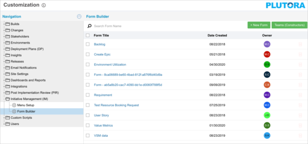
To manage Form Designer:
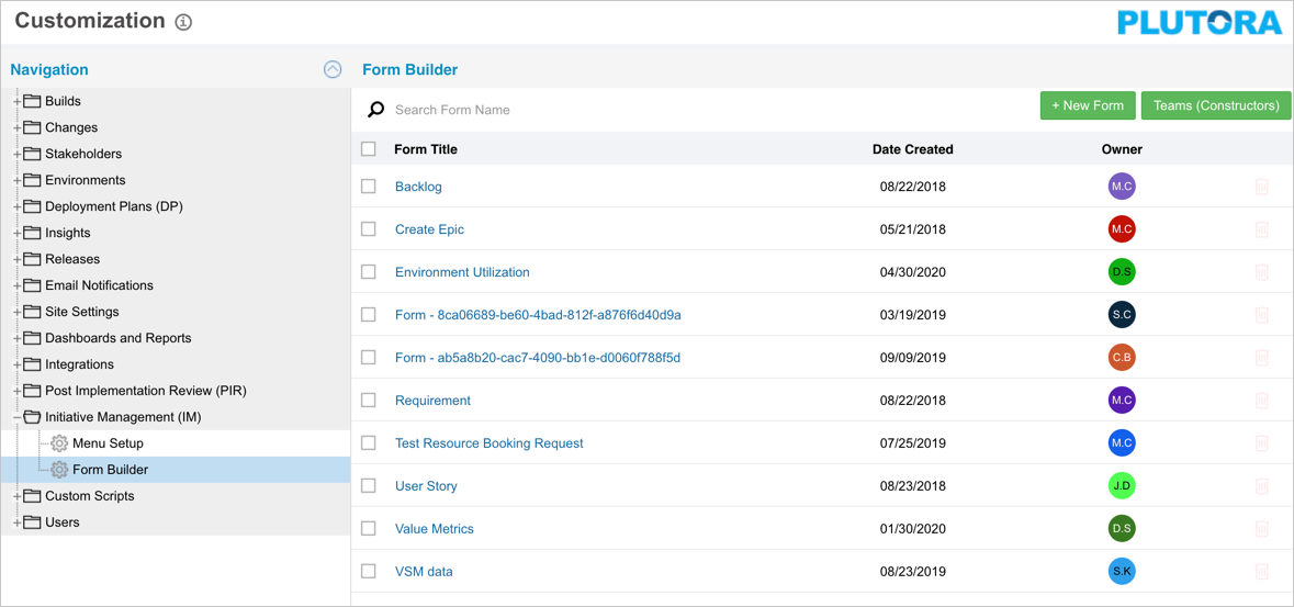
- Go to Settings
 > Customization > Initiative Management (IM).
 - Click Form Builder.
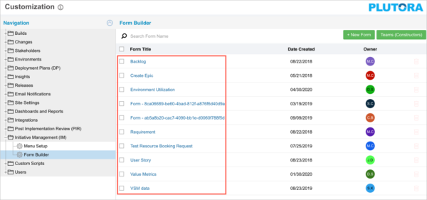
- Add or edit forms:
- To add a form:
- Click + New Form to open a new form in Form Designer.
- Click + New Form to open a new form in Form Designer.
- To edit a form:
- Click a Form Title to edit a form in Form Designer.
- Click a Form Title to edit a form in Form Designer.
- To add a form:
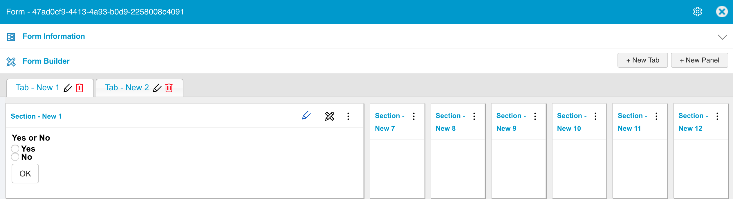
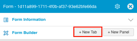
- Manage tabs:
- Add a tab:
- Click + New Tab.
- Click + New Tab.
- Rename a tab:
- Click the pen icon.

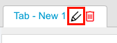
- Edit the tab title.
- Click Submit.
- Click the pen icon.
- Delete a tab:
- Click the red delete button.

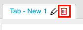
- Click Confirm.
- Click the red delete button.
- Add a tab:
- Manage panels (also known as sections):
- Add a panel:
- Click + New Panel.
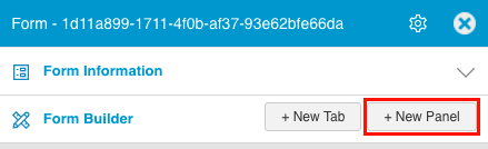
- Click + New Panel.
- Rename the panel:
- Click the pen icon.

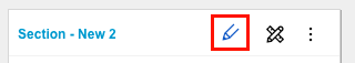
- Edit the new panel title.
- Press the Enter key on your keyboard.
- Click the pen icon.
- Rearrange a panel:
- Left click and drag a panel to change its position.
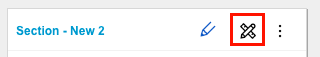
- Resize a panel:
- Drag a panel by its bottom-right corner to change its size.

- Drag a panel by its bottom-right corner to change its size.
- Delete a panel:
- Click the panel menu.
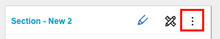
- Click Delete.
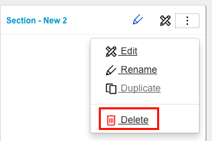
- Click Yes to confirm.
- Click the panel menu.
- Add a panel:
- Manage fields:
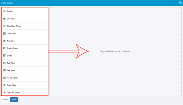
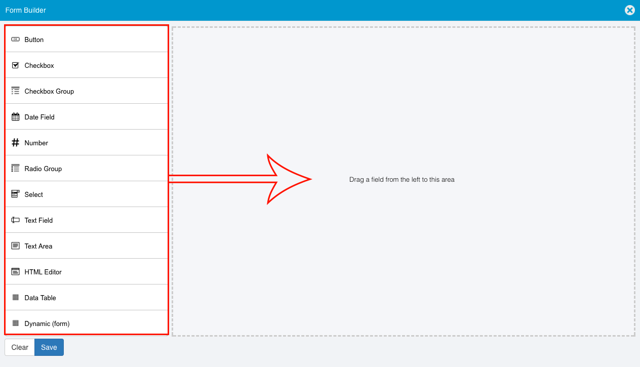
- Add a field:
- Click the edit button on a panel.

- Drag and drop field types from the left-hand column into the circled area.
- Hover your mouse cursor over the field to make the buttons appear.
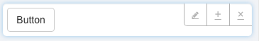
- Edit the field.

- Copy the field.

- Remove or delete the field.

- Edit the field.
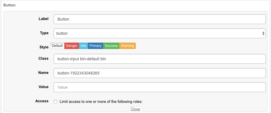
- Edit a Button field:
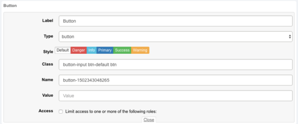
- Label: Edit the text that will be displayed on the button.
- Type: Select one of the following types from the Type drop-down menu:
- button:
- Button has no actions when clicked.
- The label can be used as a message.
- open_form:
- On button click, open one of the forms selected in the Possible Children field in Form Information.
- Select the IM form from Select Form.
- custom_script:
- On button click, run a custom script.
- The custom script must be attached to the button ID.
- button:
- Style: Click to select a button color.
- Class: Edit the class text.
- The Class field automatically populates as selections, such as style, are made.
- Name: Edit the button name.
- The Button name is automatically generated.
- Value: The initial, default value of the field.
- Access: This field will limit access to selected roles but is currently not implemented.
- Click Save.
- Click the X in the top-right corner to close the pop up.
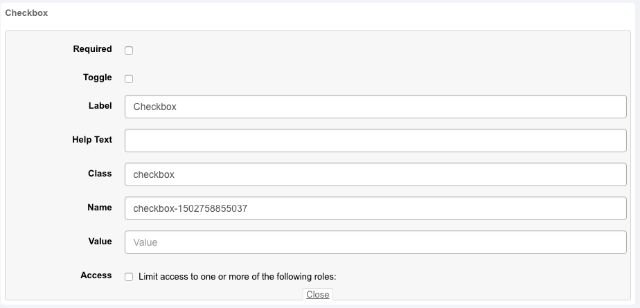
- Edit a Checkbox field:

- Required: Click to select the Required checkbox if the field must be filled in before saving.
- Toggle: This field is not yet implemented but will allow the checkbox to be a toggle switch.
- Label: Edit the text that will be displayed with the field.
- Help Text: Edit the text that will be displayed when a user hovers their mouse cursor over the i
 beside the field.
 - Class: Can be used to point to a class in a style sheet or used by JavaScript to make changes to HTML elements with a specific class.
- Name: Edit the checkbox name.
- The Checkbox name is automatically generated.
- Value: The initial, default value of the field.
- Access: This field will limit access to selected roles but is currently not implemented.

- Click to select the Limit access to one or more of the following roles checkbox.
- Click to select a role.
- Click Save.
- Click the X in the top-right corner to close the pop up.
- Edit a Checkbox Group field:
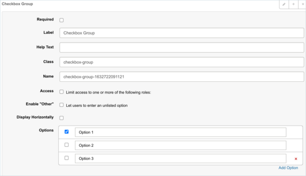
- Required: Click to select the Required checkbox if the field must be filled in before saving.
- Label: Edit the text that will be displayed with the field.
- Help Text: Edit the text that will be displayed when a user hovers their mouse cursor over the i beside the field.
- Class: Can be used to point to a class in a style sheet or used by JavaScript to make changes to HTML elements with a specific class.
- Name: Edit the Checkbox Group name.
- The name is automatically generated.
- Access: This field will limit access to selected roles but is currently not implemented.
- Enable “Other”: Allows users to select an option that is not listed.
- Options:
- Click Add Option and type a title to add a checkbox to the group.
- Delete a checkbox by clicking the red X.
- Click Save.
- Click the X in the top-right corner to close the pop up.
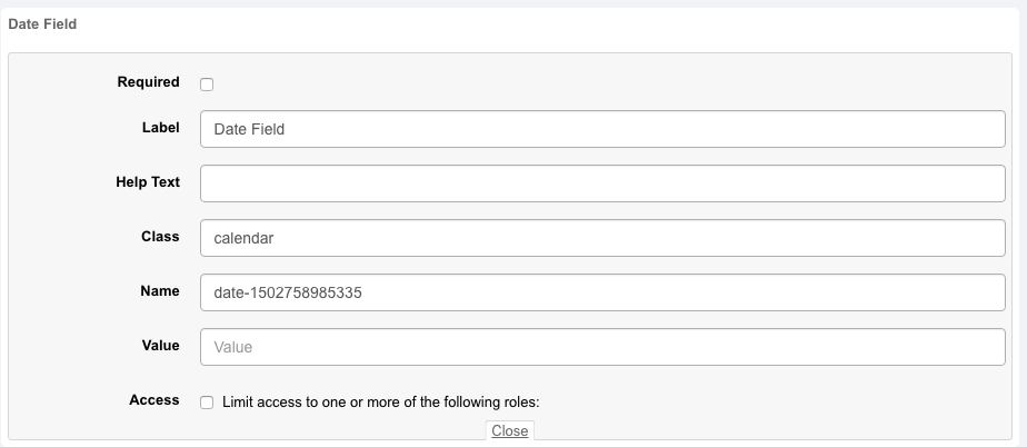
- Edit a Date Field field:
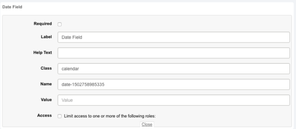
- Required: Click to select the Required checkbox if the field must be filled in before saving.
- Label: Edit the text that will be displayed with the field.
- Help Text: Edit the text that will be displayed when a user hovers their mouse cursor over the i beside the field.
- Class: Can be used to point to a class in a style sheet or used by JavaScript to make changes to HTML elements with a specific class.
- Name: Edit the Date Field name.
- This name is automatically generated.
- Value: The initial, default value of the field.
- Access: This field will limit access to selected roles but is currently not implemented.
- Click Save.
- Click the X in the top-right corner to close the pop up.
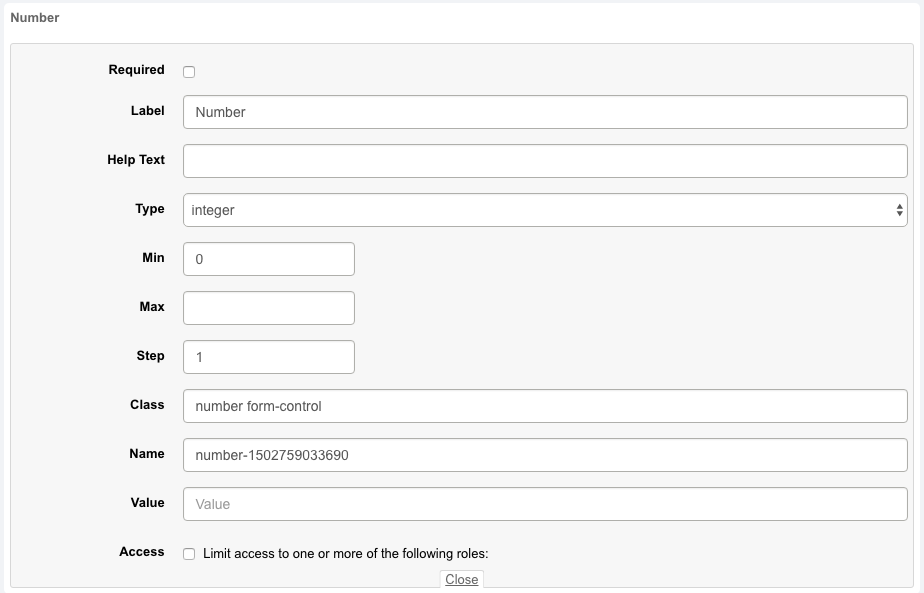
- Edit a Number field:
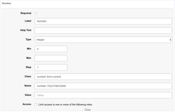
- Required: Click to select the Required checkbox if the field must be filled in before saving.
- Label: Edit the text that will be displayed with the field.
- Help Text: Edit the text that will be displayed when a user hovers their mouse cursor over the i beside the field.
- Type:
- Integer: A number without decimal places.
- Decimal: Select the number of decimal places, minimum value, maximum value, and step.
- Currency.
- Min: The minimum value.
- Max: The maximum value.
- Step: The steps between values, for example, 1.
- Class: Can be used to point to a class in a style sheet or used by JavaScript to make changes to HTML elements with a specific class.
- Name: Edit the Number field name.
- The Name field is automatically generated.
- Value: The initial, default value of the field.
- Access: This field will limit access to selected roles but is currently not implemented.
- Click Save.
- Click the X in the top-right corner to close the pop up.
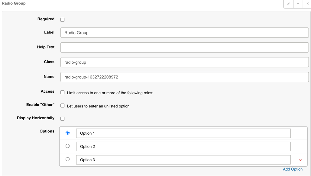
- Edit a Radio Group field:

- Required: Click to select the Required checkbox if the field must be filled in before saving.
- Label: Edit the text that will be displayed with the field.
- Help Text: Edit the text that will be displayed when a user hovers their mouse cursor over the i beside the field.
- Class: Can be used to point to a class in a style sheet or used by JavaScript to make changes to HTML elements with a specific class.
- Name: Edit the Radio Group field name.
- The name field is automatically generated.
- Access: This field is not yet implemented.
- Enable “Other”: Allows users to select an option that is not listed.
- Display Horizontally: Display the radio group as a row of buttons, rather than a column of radio buttons.
- Options:
- Click Add Option and type a title to add a radio button to the group.
- Delete a radio button by clicking the red X.
- Click Save.
- Click the X in the top-right corner to close the pop up.
- Edit a Select field:
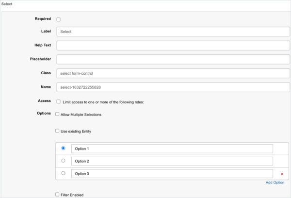
- Required: Click to select the Required checkbox if the field must be filled in before saving.
- Label: Edit the text that will be displayed with the field.
- Help Text: Edit the text that will be displayed when a user hovers their mouse cursor over the i beside the field.
- Placeholder: Edit the text that will appear in the field before anything is selected.
- Class: Can be used to point to a class in a style sheet or used by JavaScript to make changes to HTML elements with a specific class.
- Name: Edit the Select field name.
- The name field is automatically generated.
- Access: This field will limit access to selected roles but is currently not implemented.
- Options:
- Allow Multiple Selections: Turns the drop-down menu into a combo box which allows multiple selections.
- Use Existing Entities: Populate the drop-down menu with:
- Release Entity: Release Names.
- System Entity: System Names.
- Environment Entity: Environment Names.
- User Entity: User Names.
- Team Entity: Team Names.
- Form Entity: Link to other form types.
- Link drop-down menus by selecting Filter and the top-level menu.
- For example, create a Select field for Teams, then another for Users, click Save, and select the Filter checkbox for Users so that a Team can be selected, which will then filter and allow selection of the Users in that team.
- Manage Options:
- Click Add Option and type a title to add a menu item group.
- Delete a menu item by clicking the red X.
- Click Save.
- Click the X in the top-right corner to close the pop up.
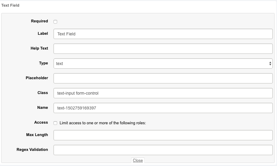
- Edit a Text field:
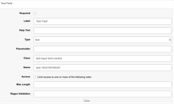
- Required: Click to select the Required checkbox if the field must be filled in before saving.
- Label: Edit the text that will be displayed with the field.
- Help Text: Edit the text that will be displayed when a user hovers their mouse cursor over the i beside the field.
- Type: Text, password, email, color, or telephone.
- Placeholder: Edit the text that will appear in the field before anything is selected.
- Class: Can be used to point to a class in a style sheet or used by JavaScript to make changes to HTML elements with a specific class.
- Name: Edit the Text field Name.
- The Name field is automatically generated.
- Access: This field will limit access to selected roles but is currently not implemented.
- Max Length: The maximum number of characters.
- Regex Validation: Type a regular expression.
- Click Save.
- Click the X in the top-right corner to close the pop up.
- Edit a Text Area field:
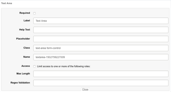
- Required: Click to select the Required checkbox if the field must be filled in before saving.
- Label: Edit the text that will be displayed with the field.
- Help Text: Edit the text that will be displayed when a user hovers their mouse cursor over the i beside the field.
- Placeholder: Edit the text that will appear in the field before anything is selected.
- Class: Can be used to point to a class in a style sheet or used by JavaScript to make changes to HTML elements with a specific class.
- Name: Edit the Text Area field Name.
- The Name field is automatically generated.
- Access: This field will limit access to selected roles but is currently not implemented.
- Max Length: The maximum number of characters.
- Regex Validation: Type a regular expression.
- Click Save.
- Click the X in the top-right corner to close the pop up.
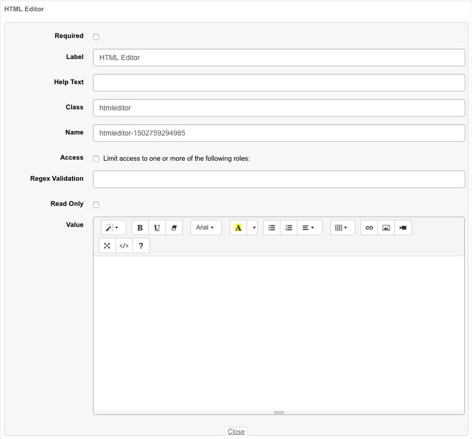
- Edit an HTML Editor field:

- Required: Click to select the Required checkbox if the field must be filled in before saving.
- Label: Edit the text that will be displayed with the field.
- Help Text: Edit the text that will be displayed when a user hovers their mouse cursor over the i beside the field.
- Class: Can be used to point to a class in a style sheet or used by JavaScript to make changes to HTML elements with a specific class.
- Name: Edit the HTML Editor field Name.
- The Name field is automatically generated.
- Access: This field will limit access to selected roles but is currently not implemented.
- Regex Validation: Type a regular expression.
- Read Only: Select this checkbox to make the text you have entered in the Value field appear as an uneditable text message.
- Value: The initial, default value of the field.
- Click Save.
- Click the X in the top-right corner to close the pop up.
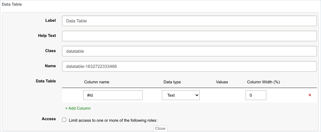
- Edit a Data Table field:
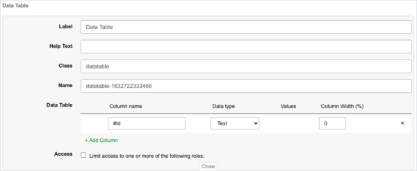
- Label: Edit the text that will be displayed with the field.
- Help Text: Edit the text that will be displayed when a user hovers their mouse cursor over the i beside the field.
- Class: Can be used to point to a class in a style sheet or used by JavaScript to make changes to HTML elements with a specific class.
- Name: Edit the Data Table field Name.
- The Name field is automatically generated.
- Data Table:
- Add a data column: Click + Add Column, then type the Column Name, choose the Data type, type the default Values, and the percentage Column Width.
- Delete a data column: Click the red X.
- Access: This field will limit access to selected roles but is currently not implemented.
- Click Save.
- Click the X in the top-right corner to close the pop up.
- Edit a Dynamic (form) field:
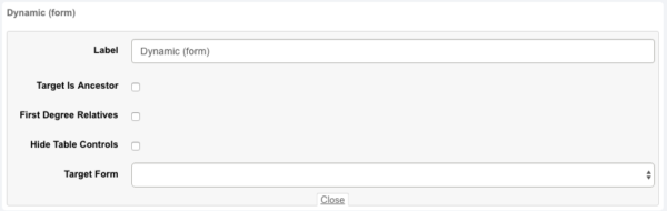
- Label: Edit the text that will be displayed with the field.
- Target Is Ancestor: Looks for related, parent forms.
- First Degree Relatives:
- If selected, looks for related forms that are only one level up or down (parent or child).
- If not selected, looks for related forms that are any number of levels up or down (grandparents, grandchildren and so on).
- Hide Table Controls: Hide the pagination controls if the table only contains a few records and pagination is not necessary.
- Target Form: Select the target form.
- Click Save.
- Click the X in the top-right corner to close the pop up.
- Click the edit button on a panel.
- Add a field:


