
Introduction
The Value Stream Flow Metrics dashboard lets you track your flow metrics with the least effort. You can view metrics like lead time, cycle time, completed work items distribution, workload distribution per month, flow efficiency, across the date range or month you select to filter the values.
This dashboard provides you with various interactive charts and graphs. For example, you can see your total work items completed within a selected period, the average lead and cycle time, the longest and the shortest lead time, a work item’s cumulative flow chart broken into planning, execution, implementation, and completed/cancelled stages. It enables you to:
- deliver realistic project estimates and real-time updates.
- provides you end-to-end visibility across the value stream, thus you can prioritize your projects and establish goals.
- Gives you visibility into the value stream, making it fast and easy to act and improve development.
Pre-requisite
- You must have defined the modes and statuses in Customization.
- To be able to view the VSFM Dashboard, you must have ‘Changes’ permission.
Navigation
Dashboard > Value Stream Flow Metrics
Access VSFM
To access the VSFM dashboard navigate to Dashboard > Value Stream Flow Metrics.
Value Stream Flow Metrics displays various charts and flow metrics. You can set the date range and Value Stream filters to view the charts and graphs as per your requirement. By default, the ‘Last 6 months’ date filter is applied.
To apply the filter, select From and To date and then click ![]() .
.
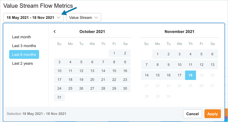
You can view the flow metrics of up to ‘Last 2 years’.
Charts and Flow Metrics – In Detail
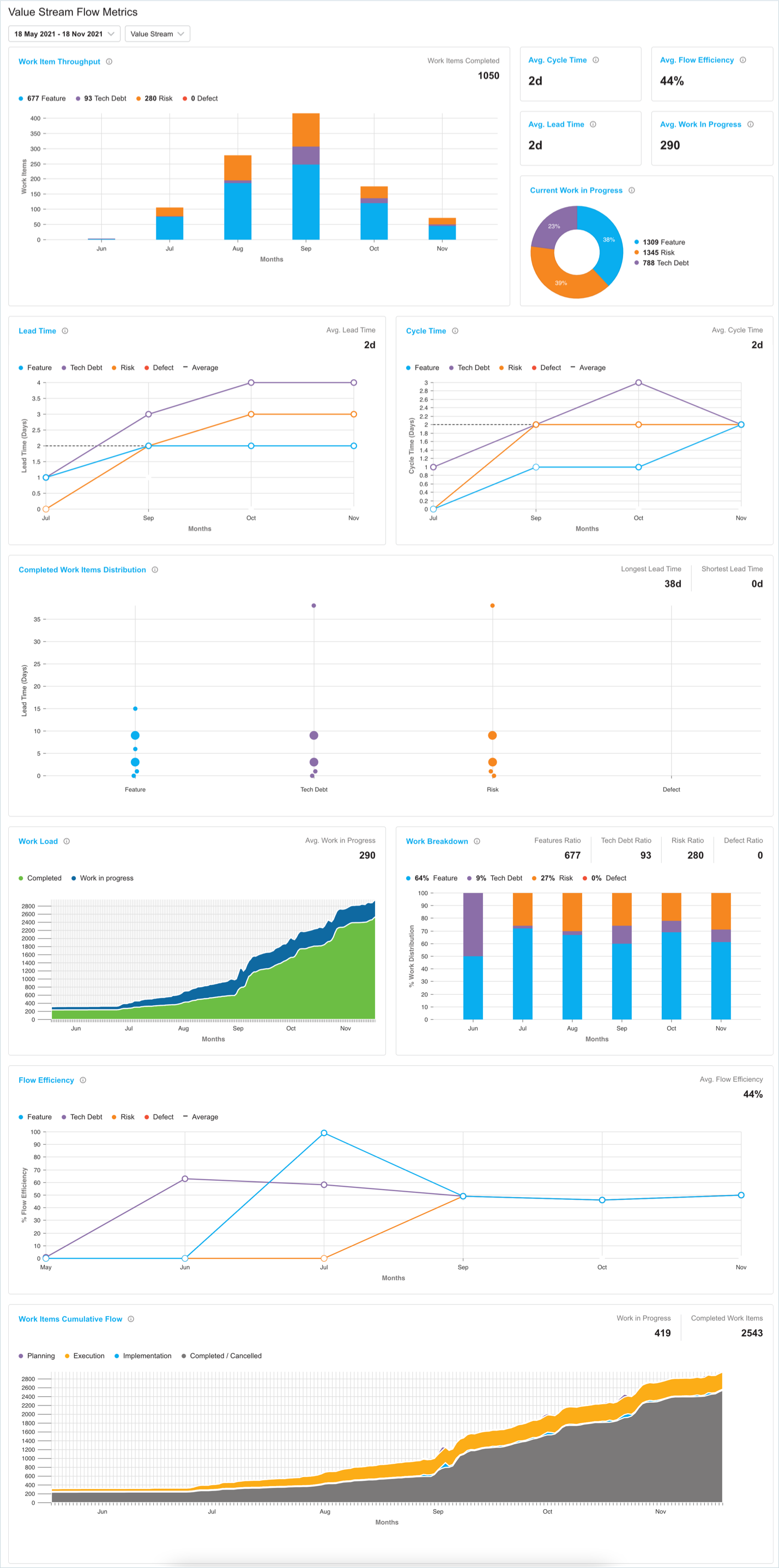
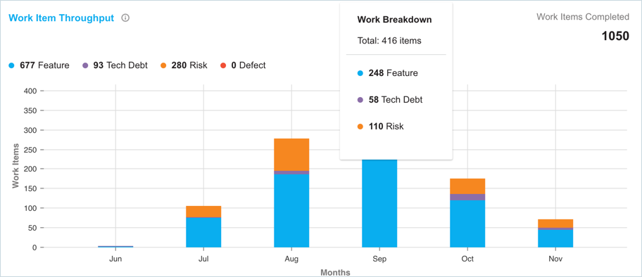
Work Item Throughput
By measuring Throughput, it is possible to determine the total amount of value delivered during a particular project.
It uses the ‘Completed Date’ of the Initiative, Epic, Feature, Story or Defect to group and count the work items delivered each month
The following information is displayed by this graph:
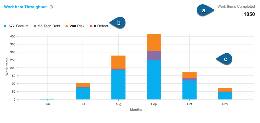
- The total number of work items completed within the selected date range. This includes Feature, Tech Debt, Risk, and Defect work types.
- Work type distribution that made up the chart.
- Throughput chart showing work item distribution per month for the selected date range.
Hover over the graph to view the work breakdown count per month:
High throughput can lead to more value delivered to customers. Analyzing throughput on a historical basis can also help you determine how conflicting priorities impact overall value.
Avg. Cycle Time
The count of days displayed is the average Cycle Time per month for all the work items with a closed date within the selected date range. Low cycle time can increase the value stream throughput.

Avg. Lead Time
The count of days displayed is the average Lead Time per month for all the work items with a closed date within the selected date range. Low lead time can increase the value stream throughput.

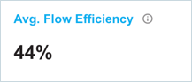
Avg. Flow Efficiency
The Flow Efficiency percentage per month for all the work items with a closed date within the selected date range. Low efficiency can be an indication of process bottlenecks.
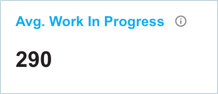
Avg. Work In Progress
This count displays the average work in progress per day for all the work items with a work in progress status within the selected date range.
Current Work in Progress
This graph shows the current work in progress for your value stream. The following information is displayed by this chart:
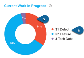
- count of work items per work type
- percentage of the work items per work type
High levels of work in progress can increase lead times and reduce throughput.
Lead Time
Lead time captures the number of days from when a work item was in the ‘Planning’ mode to when it is completed/cancelled state. This includes understanding when the work item is moved from a backlog to the time it is released. Lead time gives you an understanding of the overall time you took to move work items through your pipelines.
On the chart, the count is shown as an average per month based on the month that work item was closed. The chart displays the following information:
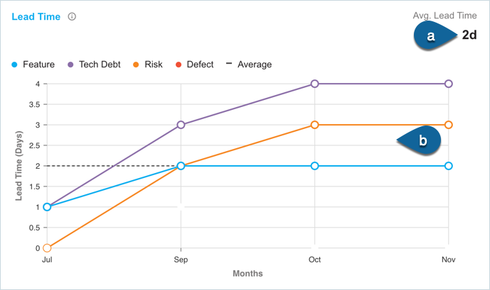
- The average lead time calculated per month for all the work items with a closed date within the selected date range.
- Lead Time chart showing the Lead Time in days per month.
Hover over the chart to view the month’s average lead time:
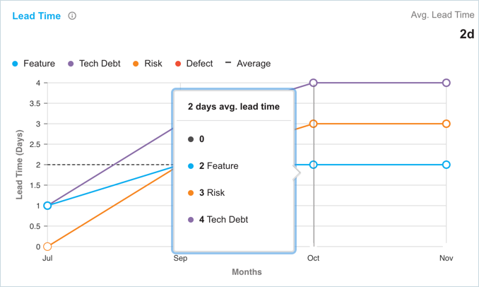
Decreasing Lead Time means that your value stream has reduced the planning-to-execution duration of work items, and most likely has increased throughput. Minimizing the Lead Time creates a more continuous flow of value to customers, allowing them to realize the features they request faster.
Cycle Time
Cycle time captures the number of days from when a work item is at the ‘Execution’ state to when it is ‘Completed/Cancelled’ state. This includes measuring the amount of time it takes for work items to move from work start to work complete.
On the chart, the count is shown as an average per month based on the month that work item was closed. The chart displays the following information:
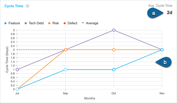
- The average Cycle Time calculated per month for all the work items with a closed date within the selected date range.
- Cycle Time chart showing the Cycle Time in days per month.
Hover over the chart to view the month’s average cycle time:
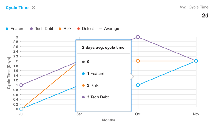
Decreasing cycle time means that your value stream has reduced the delivery time of work items and likely has increased throughput. Measuring cycle time can also make it easier to provide development time estimates and allocate resources. It can result in tighter workflows and improved efficiency.
Completed Work Items Distribution
This graph shows the lead time for all the work items that have a completed date in the selected date range. The work items are grouped into clusters, which depict the stack of individual items closed over time. This graph can lead to more predictability in delivery.
The following information is displayed by this graph:
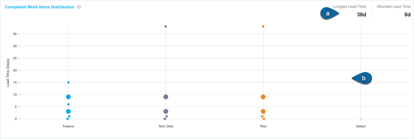
- The longest and the shortest lead time calculated for the work items within the selected date range.
- The graph shows the lead time per work item distribution.
Click on the dot to display the number of days lead time for the clustered distribution of the work items. The dot size on the graph is relative to the cluster of stories. More the cluster, the bigger the dot.
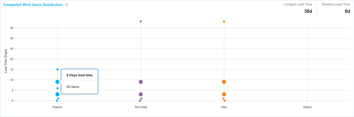
For a cluster of 5 or less than 5 work items, the link to the work items is displayed.

Work Load
This chart shows the count of work items in work in progress modes (Planning, Execution, and Implementation) and completed work items mode (Completed and Cancelled) over time.
The following information is displayed in this chart:
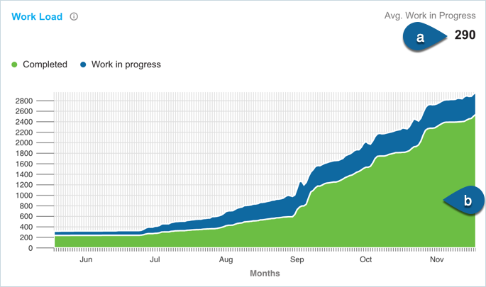
- Average of the work in progress work items
- Count of work items in Completed and Work in Progress mode per day
Hover over the chart to view the Work in Progress vs Completed work items count per day.

Greater divergence of Work in progress to Completed items can slow down throughput and increase cycle and lead time.
Work Breakdown
This chart is similar to the Work Items throughput chart and uses the ‘Completed Date’ of the associated work item.
The following information is displayed by this chart:
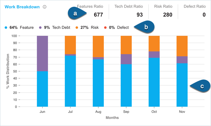
- the ratio of the work types delivered per story type.
- percentage of the work type delivered per story type.
- Chart displaying the percentage of work type distribution per month.
Hover over the chart to view the percentage of work type breakdown per month.
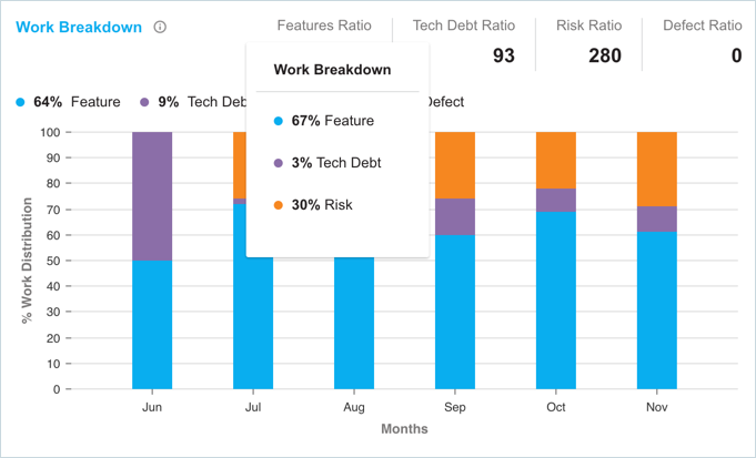
Unbalanced delivery of work types can lead to reduced feature delivery or create a greater need to deliver tech debt, defect, or risk work items in the future.
Flow Efficiency
Flow efficiency is the ratio of active time to wait time. It is the time a work item has been in an active state as a percentage of the total Lead time. Flow Efficiency is displayed per month for all the work items with a completed date in that month.
Measuring flow efficiency shows where bottlenecks are occurring and whether process waste is increasing or decreasing.
The following information is displayed by this chart:
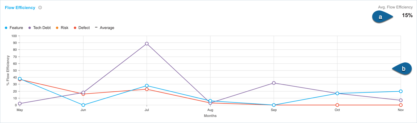
- the average Flow Efficiency percentage for the selected date range.
- chart displaying the Flow Efficiency per Work Type per month.
Hover over the chart to view the percentage of flow efficiency per month.
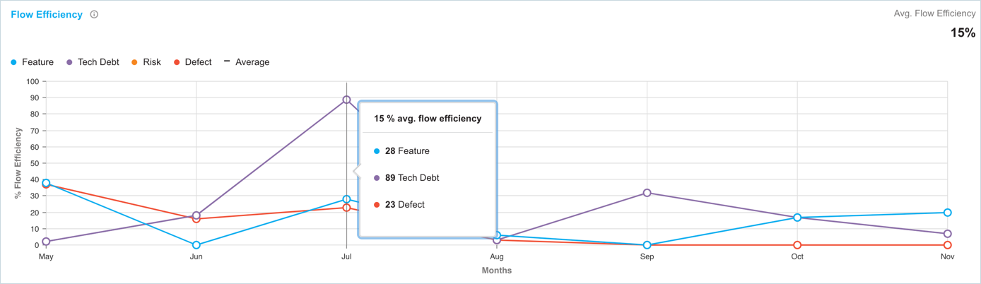
When Wait Time accounts for most flow time it creates bottlenecks and drives up production costs. By measuring flow efficiency, you can identify when workflows are taking too long.
Work Items Cumulative Flow
This graph shows the movement of work items through modes in your value stream. It counts the work items in each mode and the data is shown per day on the graph. The following information is displayed by the graph:

- total count of work items in ‘Work in Progress’ mode and ‘Completed’ mode within the selected date range.
- graph displaying the flow of work items through different modes on each day.
Hovering over the graph displays the count of work items on each mode per day.
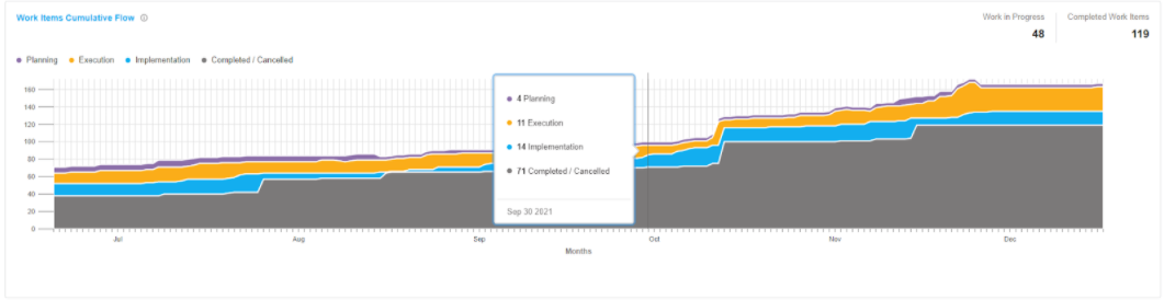
Bulging, disappearing or flat lines between modes can indicate issues in your value stream flow.